My recent trip to Cornwall provided plenty of inspiration for new paintings. The place is famous for its light, and this was true while I was down there. I stayed in the very southernmost part of the county in the Lizard peninsular, and then in the west around St Just and Sennen Cove. There’s no need for me to describe the details of my visit, except to say that I filled two sketchbooks with work! Below are a couple of finished paintings from sketches done there.
Hillside near the Geevor tin mine.Sennen CoveFishing boat at Cadgwith
Black Ashop Moor. Mixed media painting on paper. 15x10ins. Although there is some sense of space in this work, I didn’t deliberately concentrate on trying to paint it as I worked. Grey and mauve predominate and those colours themselves often suggest distance.
In paintings I completed recently I’ve had to think more about depicting a sense of space while, at the same time, using more of the abstract elements that feature in my work. Most paintings that attempt some kind of realism also, in many cases, attempt to depict space in some way. This is the difficulty in abstract or semi-abstract work: making decisions about whether to make a feature of the picture plane or how far back to push it. Representing space is one of the most difficult aspects of painting and artists have come up with many different methods of showing or implying it in their work.
In my own paintings I don’t worry too much about how I represent space, but I feel it does have to be represented in some way. In art that is completely abstract, there is no real need to portray a sense of depth, The flat picture plane aids the artist in his selection of colour, shape and texture. Even some semi-abstract works pay scant heed to conventions of representing depth. In my own paintings one can hopefully get some kind of a sense of space; this is a deliberate thing, although if the painting works without it I don’t worry too much. I don’t set out to paint in a particularly abstract way, or even strive for complete realism. I know my work has abstract qualities and I often deliberately stress those in particular paintings. Dots and splatters of paint often suggest rocks, stones and scree, broken or crumbling dry stone walls; wheels ruts and tracks are indicated by meandering lines. All these elements are abstract in nature and I’m aware they don’t necessarily have much to do with a representation of space when I paint them.
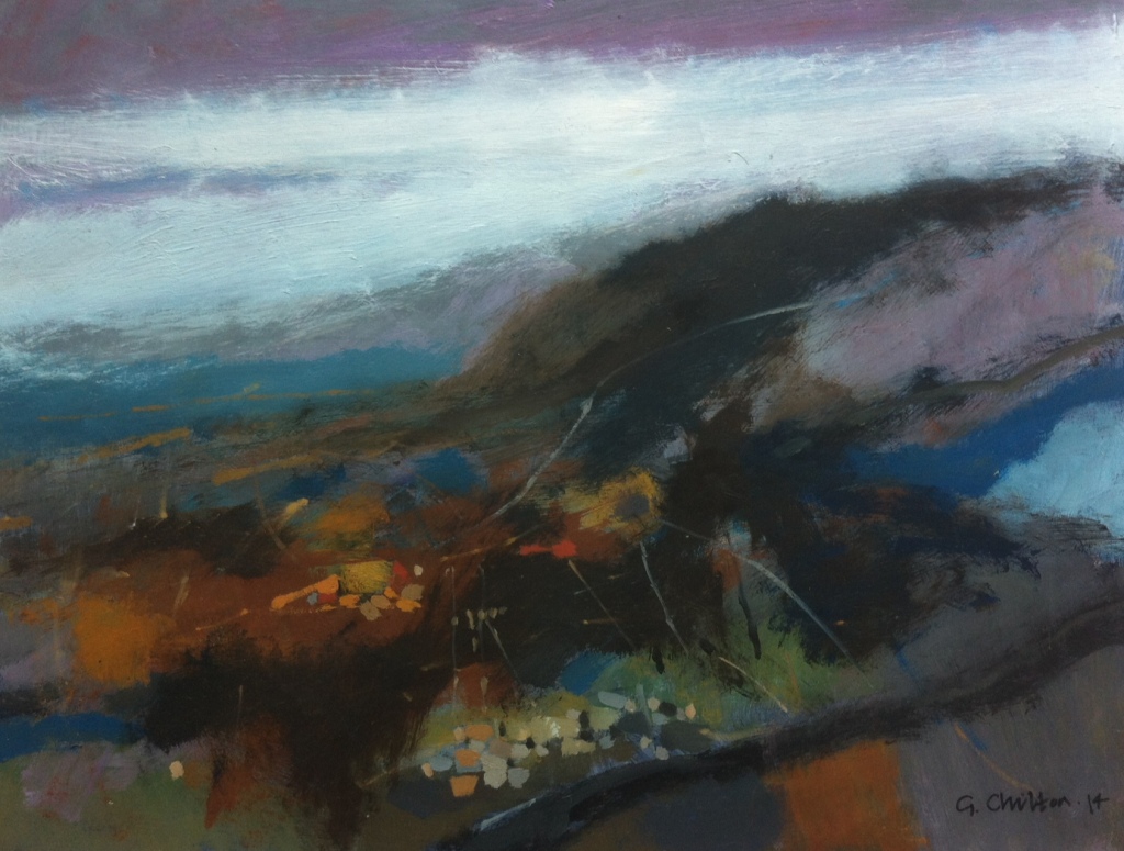
Space is often implied by colour and by using certain hues a sense of recession can be hinted at. In the painting Moorland Towards Rowarth shown below, most of the colour towards the horizon is deliberately kept to a blue, grey or mauve, implying that the landscape is receding into the distance. This, along with the fact that the colour in that area has been applied in thin bands that could be either hills or clouds, and the foreground, too, is little more than an abstract area of daubs, lines and dots, implies a sense of distance.
Moorland Towards Rowarth. Mixed media on board. 20x16ins. By blocking out the top third of the painting you’re left with a completely abstract image of dots, lines and daubs that are merely suggestive of landscape elements.
Painting an abstract or semi-abstract work is just as difficult as painting a representational one and as much thought goes into their design, composition and execution as any other piece, if not more. Everything has to work in a much more coherent way. The contiguity of line, shape and colour needs to be considered extremely carefully if the work is to be successful.
I’ve wanted to begin a series of new paintings for a while, not ones that share the same theme in a very broad sense, like landscapes of Derbyshire or scenes of Scotland for instance, but related images of the same subject that are closely connected, works that try to answer the same question and perhaps share some of the same motifs. I was provided with a theme a few days ago when I watched a TV documentary about the geology and topography of Iceland.
There were a series of images, presumably shot with a drone camera, of the surface of the Vatnajokull glacier. The textures, colour and patterns of this ice sheet were incredible. Fortunately, I was watching via Sky – a system that has the capability to pause, rewind and fast forward the action – so I paused the programme and took some photos of the screen on my phone. Some artists might eschew using images captured in this way, even of using photos at all, but I have no qualms about doing so. Of course I would like to travel to Iceland, take a helicopter trip its remote areas and sketch them, but the Covid-19 restrictions, not to mention my own impecunious state, prevent me, so I’m reduced to using the TV for my stimulus.
The images I saw were aerial shots, some looking straight down, others were slightly oblique views. I was fascinated by the sunlight on the ice, the brightness of it and its clarity. The crevasses were deep and in heavy shadow which were of the deepest blue, almost a pure cobalt. The whole surface was shot through with black and grey cracks like a web of inky lines that contrasted with the brilliance of the ice. It was a scene of total abstraction, and yet completely natural. I could see these images forming the basis of a project of my own.
Vatnajokull I. The first drawing I made from the TV images .
The first pieces I made were relatively realistic drawings from the photos. I used a B pencil and added pastel pencils for colour. I’m comfortable with them and drawing media seemed more suitable anyway. Already I was thinking about finished works and what I would use to tackle them; soft pastels seemed the logical choice for me; paint seemed inappropriate for these first forays. Later, after I had explored the subject a little, paint might be a possibility.
I made a few drawings and analysed the subject a little more, making notes on my observations and how they affected me. After further representational pieces I began working on some more purely abstract sketches, simplifying lines, shapes and colours to try and resolve some of the issues of structure and composition that I felt were inherent in the originals.
A page from my sketchbook showing a few of the smaller drawings I made from the original photos.Vatnajokull V. Once of the first representational drawings I made of the glacier surface.Abstract thumbnail sketches from Vatnajokull V
I don’t know if I will continue with this series of paintings. I need to think about the work for a while and decide whether it merits being turned into larger finished pieces. Most artists agree there can be no snap decisions made about creative pieces. Plans for works of art, paintings in progress, three-dimensional pieces or whatever, are better viewed with a fresh eye after being hidden or put away for a short time. I’ll look at this material again, perhaps in a week or two and make some decisions then. Watch this space!
There are times when I believe I can paint anything. I’m so full of confidence and bravura that I feel I could paint the most complicated picture and it be good. Only when I get behind the easel and I’m faced with, not only the subject, but my own deficiencies and imperfections as a painter, that I realise that in reality I’m lamentably poor. Others will protest and say ‘No, Geoff, your work is marvellous!’ But what these people are doing is comparing my talent to theirs. Any artist worth his salt must strive to improve, and that means comparing himself to those he sees as superior. Personally I look to Rembrandt, Durer, Turner, Constable, Stanley Spencer and Lucien Freud – they are my thunderbolts. I know I will never be as good as they are, but isn’t it worth trying? If you have no real desire to improve, you won’t. I know painters who don’t have such a hunger; they’re content to settle for the lucre when they sell something and that is their only goal.
A painting done a few years ago in the Dark Peak area of Derbyshire. The sky and far distance work, showing the atmosphere of the day, but the foreground is rather derivative and lacks significance.
I’m very self-critical about my work. Painting has never been an easy thing to me. I have always struggled; it has always been hard work. I recently read a biography of the Austrian artist Egon Schiele. He was one of those rare individuals who seem to have been born with talents fully-formed. He died aged twenty-eight, having produced hundreds of drawings and watercolours all showing a mastery of form, line and composition. And he wasn’t alone. One doesn’t have to search far in the annals of art history to find others who were similarly gifted. I’m afraid I don’t have the self-confidence of someone like Schiele. There may be parts of my paintings that I think just about work, and that’s the only reason I keep them. Most of the time I’m dissatisfied with 90% of what I produce, and the canvases that I consider total rubbish are recycled and painted over.
Drawing is really the key skill in art. Drawing is observation. It is of the utmost importance. When I draw or sketch I am looking for things that no one else has seen. Finding something new in a subject is the real aim in my work. Most of the time I don’t find it and my drawings are lacklustre and uninspired. My sketchbooks are really a catalogue of mistakes, which is one of the reasons I don’t like people looking at them! I know artists who never draw, or their ‘sketchbooks’ are little more than cursory representations made outside to take back to the studio to be enlarged or copied with little thought to designing a finished work where composition, form and colour are manipulated towards producing a painting that shows the hunger for improvement I spoke about earlier.
A self-portrait by Egon Schiele, painted in 1910 when he was just twenty years old.
As I said, art is really difficult, well, producing good art is. And unless you’re extremely gifted or a genius, most people, even good artists, will find it so. So, dear reader, if you’re an artist, keep struggling on. And if you’re one of the shallow ones who isn’t bothered about getting better, I hope your sales bring you joy.
I know some artists who never change the colours on their palette. They squeeze out a dollop of colour from a tube of every colour they possess and don’t think about varying the colours much from painting to painting. But selecting colour carefully before starting a work can alter your perception and interpretation (and therefore that of the viewer) of a subject by adding a bit of a twist to your normal way of thinking. Introducing a new or unusual colour into you palette can alter our impression of a painting and transform the way we understand it how we feel about it.
Allotments at Langtoft, November. A work painted using my basic Winter palette with the addition of violet.
Personally, my palette is made up of five colours – white, black, a blue, a yellow and a red. These are changed or added to according to the season and/or the subject. Winter consists of black and white, Prussian blue, alizarin crimson and yellow ochre. Sometimes I’ll paint with just those five, at other times I’ll augment them with raw umber, some kind of purple or mauve, perhaps Naples yellow or Indian red. Very occasionally I change the Prussian blue for cerulean. I hardly ever use Ultramarine or cobalt blue unless I’m painting abroad as I find them too ‘Mediterranean’. Prussian blue gives a lovely shade that is more typical of British skies even in Summer.
Once Spring arrives I’ll start to change the colours on my palette. I add a green, usually sap, sometimes chromium oxide, and perhaps add cadmium yellow and, depending on what I’m painting, I may decide to change the umber from raw to burnt. The only real change to this palette for the Summer months is to substitute alizarin for cadmium red.
Red Field. Painted in Summer with cadmium red and Naples yellow in the palette.
Autumn brings quite a few additions. I tend to keep the burnt umber and add Naples yellow, burnt sienna, sometimes Indian red or light red too, swap back the alizarin crimson instead of the cadmium and sometimes use raw sienna instead of yellow ochre. These latter colours are very similar in hue but the ochre tends to be slightly more opaque, depending on the manufacturer.
Of course, these decisions aren’t written in stone. Sometimes I go rogue and throw in a colour I don’t use very much just for the hell of it: Payne’s grey, Hooker’s green or viridian, lemon yellow or Cadmium orange. Moreover, the palettes I’ve listed are strictly for oils, acrylics and gouache paints are something else and have their own set of guidelines which are much less rigorous!